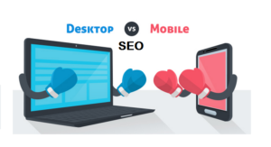
The battle between mobile and desktop SEO has never been more crucial. An estimated 60% of all web traffic now comes from mobile users. This fact might surprise you. Better search rankings demand your attention to both platforms.
People’s browsing behavior on smartphones is different by a lot from desktop browsing. To cite an instance, 76% of smartphone users who look up local businesses visit them within 24 hours. About 28% of these visits lead to purchases. Mobile search results show much more variation than desktop searches because different factors influence them. Your website might rank well on one device but struggle on another because of these variations.
Google doesn’t treat mobile and desktop versions the same way, even though we live in a mobile-first indexing world. Your rankings depend heavily on how mobile-friendly your website is. The numbers tell an interesting story – by 2025, about 72% of people will use only their mobile phones to access the web.
This piece will show you the main differences between mobile and desktop SEO. You’ll discover ways to optimize for both platforms and learn practical strategies to improve your rankings whatever platform your audience uses to find you.
User Behavior: Mobile Search vs Desktop Search
Search engines handle user interactions differently on mobile and desktop devices. These differences extend beyond just screen sizes and show how user behavior and expectations have changed over time.
Search Intent: Quick Answers vs Deep Research
Device choice shapes how people search online. Mobile users look for instant answers. They used to search mainly for directions or movie times while walking around. Desktop users tend to dig deeper into topics and do more research.
Mobile searches usually include:
- Simple, short queries (more common on smartphones)
- Location-based searches (about one-third of all mobile searches)
- Voice commands when hands are busy
Desktop searches typically show:
- Complex, detailed queries
- Multiple open tabs (4-7 tabs compared to 3 on mobile)
- Long reading sessions to get the full picture
Research shows desktop users view more pages (3.95) than mobile users (2.67). Desktop sessions last 40% longer than mobile ones. These patterns help determine how content should work on each platform.
Device Usage Context: On-the-Go vs Stationary
Location and timing affect search behavior. Mobile devices work best for people moving around, while desktops suit fixed locations better.
Mobile usage hits its peak during commute times and after work (6:00 a.m. to 9:00 a.m. and 6:00 p.m. to 11:00 p.m.). Desktop searches happen most during work hours (9:00 a.m. to 6:00 p.m.). This matches when people are at their desks.
Age plays a role in device choice. Users between 18-25 prefer mobile searches, while those above 25 lean toward desktop. This split is crucial for businesses targeting specific age groups.
People often switch devices while shopping online. They might start looking on their phone, switch to desktop to compare options, and finish buying on mobile. Data shows 58% of multi-device purchases end on mobile devices.
Click Behavior and Scrolling Patterns
Users click differently on search results depending on their device. Mobile users click through 83% more often in some cases, yet mobile pages see more bounces at 52.11%.
Search result position matters. Mobile searches see a 39.03% drop in clicks between first and second positions. Desktop shows an even bigger drop at 53.45%. After the fifth position, click rates level out on both platforms.
Scrolling habits change with devices too. Research shows people scroll further on mobile than desktop. Users often skim through mobile content like they do on social media, without reading everything.
Load times can make or break the user experience. Mobile users leave pages that take more than three seconds to load. They expect faster results than desktop users.
Search Engine Results: How Layouts Differ by Device
Search results look quite different on your phone compared to your computer. These layout changes can affect which websites get clicks and how people interact with search results.
SERP Structure: Mobile Stack vs Desktop Columns
Google shows search results differently based on your screen size. Desktop searches usually show multiple columns. The organic results appear on the left while ads or knowledge panels show up on the right. This layout works well with wider screens and lets you see more content at once.
Your phone shows everything in a single column that stacks vertically.
This creates some big differences:- You see fewer results on your screen at first
- Ads, organic listings, and rich features compete for limited space
- You need to scroll more to see the same number of results
This stacking layout makes ranking positions crucial on mobile. About 30% of pages that show up on desktop’s first page get pushed beyond the top 10 on mobile. Only 13% of websites keep similar positions on both devices.
Local Pack Visibility on Mobile
Local Pack takes over mobile screens for location-based searches. This widget sits at the top of results and often fills your entire screen. It shows a map and usually three business listings with key details.
The Local Pack grabs the #1 organic spot in 93% of local-intent searches. Users pick Local Pack results 44% of the time over other search elements.
Mobile devices give you special Local Pack features you won’t find on desktop. The click-to-call buttons that open your phone app are a great example. The built-in map helps mobile users find nearby options quickly, which matters since location heavily influences buying decisions.
Knowledge Graph and Featured Snippets Placement
Your device type determines how Knowledge Graph information appears. Desktop users see knowledge panels next to search results where there’s enough width. Mobile users see this information mixed into their results because of the narrow screen.
Featured snippets give you quick answers to questions right at the top. These snippets claim the #1 spot about 98% of the time on both devices. Mobile sometimes shows two Featured Snippets at once, while desktop rarely does.
Desktop searches show featured snippets more often (86.5%) than mobile (73.3%). In spite of that, when Google displays a featured snippet for the same keyword on both devices, it uses similar URLs 90% of the time.
Your position really matters with featured snippets. Click-through rates usually level off after position #5 on both platforms. The Products feature shows up in about 10% of searches and takes up roughly 80% of a mobile screen when fully shown.
These layout differences explain why your rankings might change between devices. That’s why you need to optimize your content for both mobile and desktop to succeed with SEO.
Mobile-First Indexing: What It Means for SEO
Google changed everything in 2016 with its announcement of mobile-first indexing. This marked a big change in website evaluation and ranking. The change continues to shape SEO strategy in 2025 and beyond.
What is Mobile-First Indexing?
Google uses your website’s mobile version as the main source for indexing and ranking with mobile-first indexing. The desktop version came first before this update. The smartphone Googlebot comes first now.
The change didn’t happen overnight. Google introduced the concept in 2016 and started rolling it out slowly in 2018. New websites defaulted to this system by 2019, with complete implementation planned for 2020. Full implementation got delayed due to the pandemic and finished in October 2023.
The numbers tell the story behind this update. Mobile devices generate 64.17% of worldwide internet traffic compared to 35.83% from desktops. Google saw that most users needed better mobile experiences. A 2022 Pew Research study backed this up – 76% of US adults prefer buying through smartphones.
Impact on Crawling and Ranking
Your website evaluation changes with mobile-first indexing. The mobile Googlebot checks your pages first and reviews content quality, structured data, metadata, and internal links from a mobile viewpoint.
Websites without proper mobile optimization face serious problems:
- Search result rankings drop (even for desktop searches)
- Less visibility on all devices
- Search results might not show the site at all
Sites with content unavailable on mobile devices became non-indexable by July 2024. Poor mobile optimization ruins your entire SEO strategy, no matter how great your desktop site performs.
Common technical problems affecting mobile indexing include:
- Structured data missing from mobile versions
- Blocked resources stopping proper display
- Poor quality mobile images
- Hidden content on mobile devices
Why Desktop Content Still Matters
Desktop optimization remains vital despite the mobile-first focus. Google analyzes desktop versions mainly for desktop search rankings. High-quality experiences on both platforms give you the best chance for visibility.
Both versions need matching content. Google wants your mobile site to have the same content as your desktop site. You should update your mobile version if it has less content than desktop.
Google doesn’t require a mobile version to appear in search results but “very strongly recommends” it. Sites with different mobile and desktop URLs show the right version based on device type. The mobile version still serves as the main index source.
Desktop usage stays strong at 35.83% of web traffic. Many people prefer desktop for detailed research or complex purchases. Users switch between devices during their experience. They might start research on mobile but buy on desktop, or do it the other way around.
The bottom line: put mobile first but don’t forget desktop users. This balanced approach helps your site succeed no matter how people find you.
Technical SEO Factors That Vary by Device
Mobile and desktop SEO have technical differences that need specific optimization strategies. These differences impact your site’s performance, user experience, and search rankings.
Page Speed: 3G vs Broadband Expectations
Load speed expectations are different between devices. Mobile sites should load within 3 seconds, but most mobile pages take 15 seconds to load on 3G connections. This matters because 70% of consumers say page speed affects their buying decisions.
Each connection type has its own speed requirements:
- 3G connections: Pages take 10-20 seconds to load completely
- 4G connections: Pages load in 1-5 seconds
- Desktop broadband: Users expect quick responses because of stable connections
Your mobile site could double its advertising revenue if pages load in five seconds instead of nineteen. Users bounce away 90% more often when load times increase from 1 to 5 seconds.
Google’s 2018 Speed Update made mobile page speed affect rankings directly, mostly impacting slower sites. Many mobile users browse with limited data plans or slower networks, so optimizing images, reducing JavaScript, and using lazy loading are crucial for mobile SEO.
Responsive Design and Layout Adjustments
Responsive design helps your website adapt to any screen size. These sites use the same URL on all devices, which helps SEO rankings. This design approach uses flexible grids, fluid layouts, and adaptive images to create better viewing experiences.
Responsive design will be standard practice by 2025. Mobile devices generate 63.38% of website traffic, so Google gives preference to responsive sites in search results.
Responsive sites cost more to build but need less upkeep over time. Content updates happen at once across all platforms, unlike separate mobile versions that need updates one at a time.
Touch-Friendly Navigation vs Mouse Interactions
Touch interfaces work differently than mouse-based designs. Touch targets should be 44×44 pixels on iOS and 48×48 pixels on Android – much bigger than what mouse pointers need.
Most people hold their phones with one hand and use their thumb, creating a “thumb zone” they can easily reach. Critical elements should stay within thumb reach, and hamburger menus save space while showing navigation options only when needed.
Desktop interfaces can handle complex menus, but mobile needs simple navigation with thumb-friendly buttons. Desktop designs can use hover effects for dropdowns, while mobile must work with direct taps.
Content Parity Between Mobile and Desktop
Content parity means keeping the same content across all devices – it’s key for mobile-first indexing. Google wants your mobile site to match your desktop site’s content.
Many sites forget to include structured data on mobile pages. Different content between versions can make Google understand your content differently, affecting both versions’ rankings.
Mobile content works better with shorter paragraphs (2-3 sentences max), but should keep the same information. Content differences can make users lose trust in your brand.
You should keep consistent headings, structured data, and meta descriptions on both versions. Different layouts like accordions or tabs can improve mobile usability as long as the content stays the same.
Keyword Strategy for Mobile vs Desktop SEO
Mobile and desktop SEO require different keyword strategies. People’s search behavior changes drastically based on their device, affecting their search terms and result preferences.
Short-Tail vs Long-Tail Queries
Mobile and desktop searches show distinct keyword patterns. Users on mobile devices prefer shorter, more concise search queries. Desktop keyboards make typing easier, which explains this behavior.
Short-tail keywords contain up to three words (like “running shoes” or “digital marketing”) and see higher search volumes. These broad terms face tough competition and convert poorly. Desktop users often use them during general research.
Long-tail keywords prove more effective on mobile. Specific phrases (such as “best running shoes for flat feet”) bring more qualified traffic. While each long-tail keyword gets fewer searches, together they generate substantial traffic. Users searching with specific phrases show stronger buying intent.
The numbers tell the story clearly – 92% of all search engine keywords are long-tail, getting 10 or fewer monthly searches.
Voice Search Optimization for Mobile
Voice search reshapes the mobile keyword scene. Speech differs from typing – voice queries sound more natural and usually form complete questions. Someone might type “weather NYC” but ask Siri “What’s the weather like in New York today?”
Voice search optimization needs:
- Question-based keywords starting with what, where, how, and why
- Conversational phrases that mirror natural dialog
- Complete sentences rather than fragmented terms
Voice search has become essential now that 55% of teenagers use it daily. Voice assistants pull answers from featured snippets about 40% of the time, making position zero crucial for mobile SEO.
Location-Based Keywords for Mobile Search
Location stands as the core difference between mobile and desktop keyword strategies. Google searches show local intent almost half the time. About 76% of smartphone users who search for nearby businesses visit them within 24 hours.
Mobile users commonly search with:
- “Near me” phrases (up 3,400% since 2011)
- Time-specific terms like “open now”
- Neighborhood or landmark references
Smart businesses weave location-specific keywords naturally into their content. City names, neighborhood terms, and proximity indicators make the biggest impact. Creating pages for specific locations boosts visibility in mobile search results significantly.
User Experience and Ranking Signals
Your website’s search engine rankings depend on how users experience it. Search results positions can rise or fall based on your site’s performance across different devices.
Core Web Vitals: Mobile vs Desktop Benchmarks
Three main metrics help measure real-life user experience through Core Web Vitals. Both devices need Largest Contentful Paint (LCP) to happen within 2.5 seconds. Mobile users face a tougher challenge because of connection limits – pages take about 15 seconds to load on 3G networks.
Response time measured by Interaction to Next Paint (INP) should not exceed 200 milliseconds. Mobile devices show lower performance scores due to their limited processing power.
Visual stability scores measured by Cumulative Layout Shift (CLS) must stay under 0.1. Desktop sites score better in CLS because they handle fewer dynamic elements.
Search engines use Core Web Vitals as a ranking signal mainly for mobile sites, though performance affects rankings on both platforms.
Mobile UX: Readability, Tap Targets, and Load Time
Mobile tap targets need proper sizing for accurate touches. Users need 48×48 pixel targets at minimum. Smaller, overlapping targets create accessibility issues and frustrate users.
Studies reveal that 82% of mobile sites place their tappable elements too close together. This leads to “rage taps” – users repeatedly tapping to hit their intended target.
Target placement matters significantly. Screen edges prove hardest to tap accurately. Top elements require 42px size minimum, while bottom elements need at least 46px.
Load times can make users leave quickly. A page that takes 6 seconds to load instead of 1 second sees bounce rates jump by 106%.
Desktop UX: Visual Hierarchy and Interactivity
Desktop interfaces work better with mouse pointers that allow complex navigation. Precise pointing enables smaller click targets and hover interactions that touch screens can’t match.
Visual hierarchy creates clear paths through information on desktop screens. Search engines and users understand content better through well-structured hierarchical design.
Desktop experiences often include more interactive elements that guide users through complex tasks. Search engines receive positive signals when these elements help users engage deeply with content.
Both platforms need user-friendly navigation and consistent branding to rank well and provide great user experiences.
Comparison Table
| Aspect | Mobile SEO | Desktop SEO |
| Traffic Share | 60-64% of web traffic | 35.83% of web traffic |
| Search Behavior | • Users prefer short-tail queries• Location-based searches make up one-third of all searches• Voice commands dominate | • Users type detailed, longer queries• Users browse with 4-7 tabs simultaneously• Reading sessions last longer |
| User Participation | • Users visit 2.67 pages per session• Bounce rates reach 52.11%• Users expect 3-second loading | • Users explore 3.95 pages per session• Users spend 40% more time on site• Users accept longer load times |
| Peak Usage Times | 6-9 AM and 6-11 PM | 9 AM to 6 PM |
| SERP Layout | • Content stacks in single column• Local Pack stands out• Call buttons take priority | • Results display in multiple columns• Results appear side-by-side• Knowledge panels occupy right side |
| Technical Requirements | • Touch targets need 44-48px• Thumb zones require optimization• Navigation needs simplification | • Click targets can be smaller• Hover states work well• Navigation allows complexity |
| Core Web Vitals | • LCP targets prove difficult• INP shows lower performance• CLS scores fluctuate | • LCP performs better• INP scores excel• CLS scores remain stable |
| Featured Snippets | Show up in 73.3% of searches | Present in 86.5% of searches |
| Ranking Position Effect | CTR drops 39.03% between #1 and #2 | CTR falls 53.45% between #1 and #2 |
Conclusion
Mobile and desktop SEO need different approaches even though they share basic principles. Google gives priority to mobile-first indexing now, but that doesn’t mean you should give up on desktop optimization. A balanced strategy works best to get maximum visibility on all devices.
Numbers tell the real story. Mobile drives over 60% of web traffic, and mobile users behave quite differently from desktop users. They search differently, interact with results in their own way, and want faster responses. Your SEO strategy needs to tackle these differences directly.
Speed makes a huge difference on mobile devices. Users leave sites that take more than three seconds to load, yet most mobile pages are five times slower. Fast loading affects bounce rates, conversion rates, and your search rankings directly.
Your content strategy must reflect how people search on different devices. Mobile users like shorter queries and often use voice search with natural language. They run more location-based searches than desktop users do. These patterns should guide your keyword research and content creation for each platform.
Technical aspects matter a lot too. While responsive design has become standard, many sites don’t deal very well with mobile-friendly navigation, properly sized tap targets, and keeping content the same between versions. Google spots these differences and might change rankings as a result.
Core Web Vitals measurements affect both platforms but create special challenges on mobile devices. Phones and tablets have less processing power and changing connection speeds, which makes it harder to hit the right LCP and INP metrics.
Rankings often vary between devices because SERP layouts are different. A website might show up at position #3 on desktop but drop to #7 on mobile due to different layout priorities and features.
The gap between mobile and desktop user behavior will probably keep growing. Smart SEO experts will adapt their strategies, making both platforms work while recognizing mobile’s growing importance.
The takeaway? You need two approaches. Focus mainly on mobile users but keep desktop experiences strong. This balanced approach helps your site rank better no matter how visitors find you.
Key Takeaways
Understanding the differences between mobile and desktop SEO is crucial for maximizing your search visibility across all devices in today’s mobile-first world.
- Mobile-first indexing is now the standard – Google primarily uses your mobile site for ranking decisions, making mobile optimization essential for all search visibility.
- User behavior differs dramatically by device – Mobile users prefer short queries and quick answers, while desktop users conduct deeper research with longer sessions.
- Page speed is critical on mobile – Sites must load within 3 seconds on mobile to prevent the 90% bounce rate increase that occurs with slower loading times.
- Technical requirements vary significantly – Mobile needs 44-48px touch targets and simplified navigation, while desktop can handle smaller elements and complex interactions.
- Location-based optimization drives mobile success – Nearly half of Google searches have local intent, with 76% of mobile local searches resulting in store visits within 24 hours.
While mobile generates 60% of web traffic and dominates search behavior, maintaining strong desktop experiences remains important for comprehensive SEO success. The key is balancing mobile-first optimization with desktop functionality to capture users across their entire search journey.
Q1. How does mobile SEO differ from desktop SEO? Mobile SEO focuses on optimizing for smaller screens, touch interfaces, and on-the-go users. It prioritizes faster load times, location-based searches, and simpler navigation. Desktop SEO allows for more complex layouts and longer-form content, catering to users typically engaged in deeper research.
Q2. What impact does mobile-first indexing have on search rankings? Mobile-first indexing means Google primarily uses the mobile version of a website for indexing and ranking. This approach can significantly affect search rankings, especially for sites not optimized for mobile devices. Websites with poor mobile experiences may see lower rankings even in desktop search results.
Q3. How important is page speed for mobile SEO? Page speed is crucial for mobile SEO. Mobile users expect pages to load within 3 seconds, and slower load times can increase bounce rates by up to 90%. Google considers page speed a ranking factor, making it essential for visibility in mobile search results.
Q4. What are the key differences in user behavior between mobile and desktop searches? Mobile users tend to use shorter queries, conduct more location-based searches, and prefer quick answers. They often search on-the-go and have shorter attention spans. Desktop users typically engage in longer research sessions, use more detailed queries, and are more likely to explore multiple pages on a site.
Q5. How should keyword strategy differ for mobile versus desktop SEO? For mobile SEO, focus on short-tail keywords, location-based terms, and voice search optimization with natural language phrases. Desktop keyword strategies can target longer, more detailed queries and complex topics. Both should consider user intent, but mobile strategies should emphasize immediate, local needs more heavily.